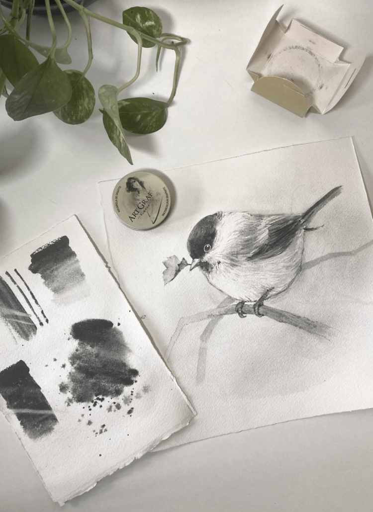
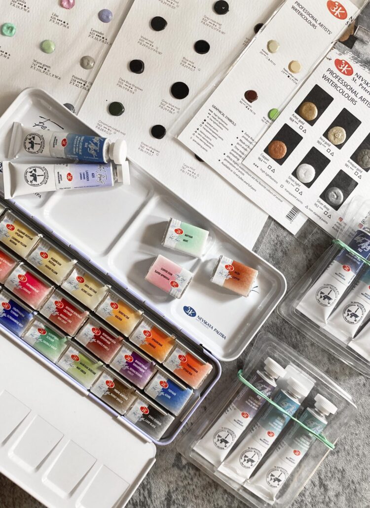
這篇將分享我手上現有的”視爵水彩”品牌的水彩顏料色票 (非完整系列)
也運用其中幾個顏色完成幾幅小作品,一起來看看吧!
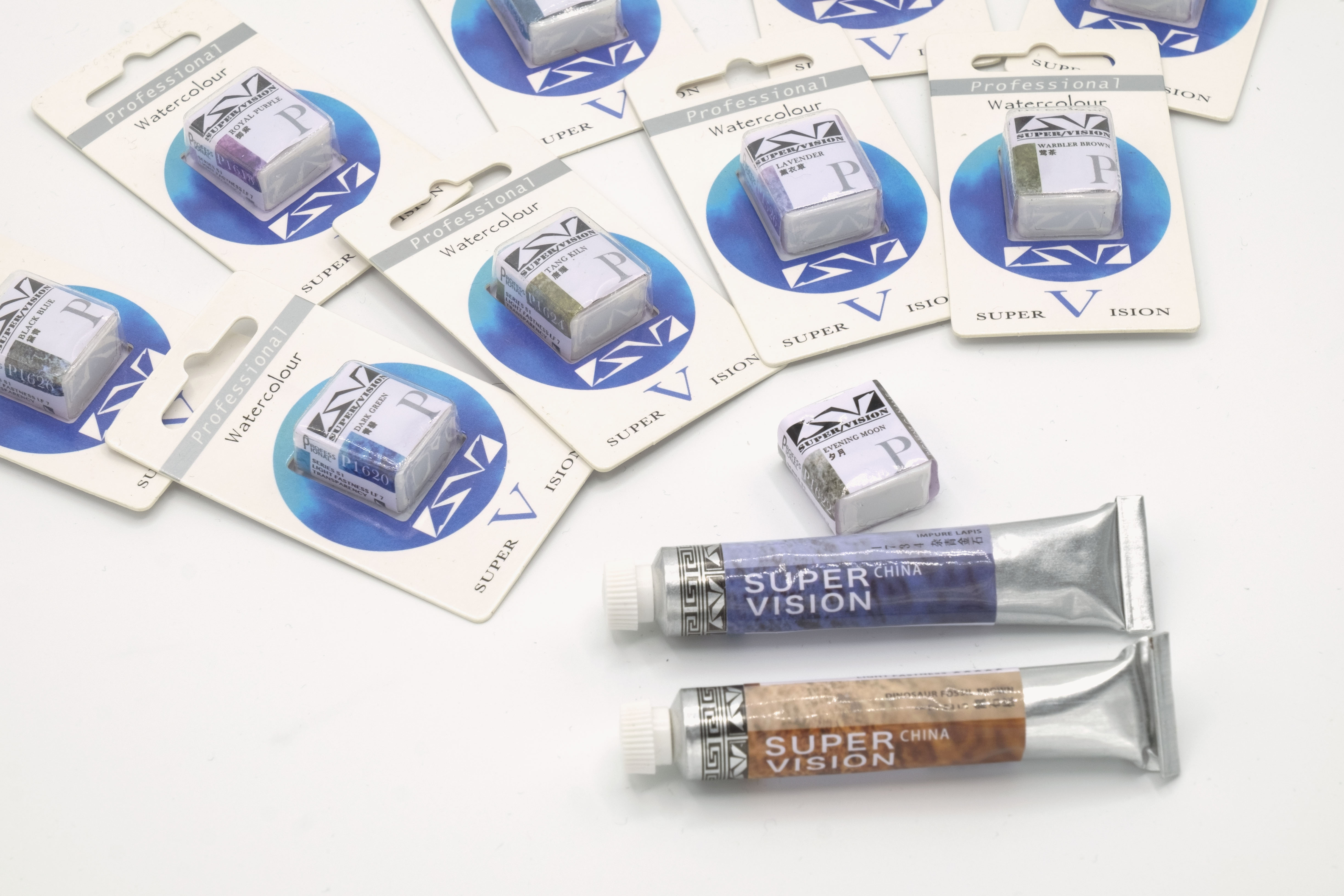
我也覺得這是可以改善的部分,因為完全無法呈現實際的顏色質感,雙色包裝有幾支也非常容易混淆
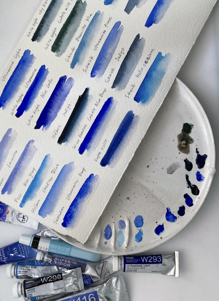
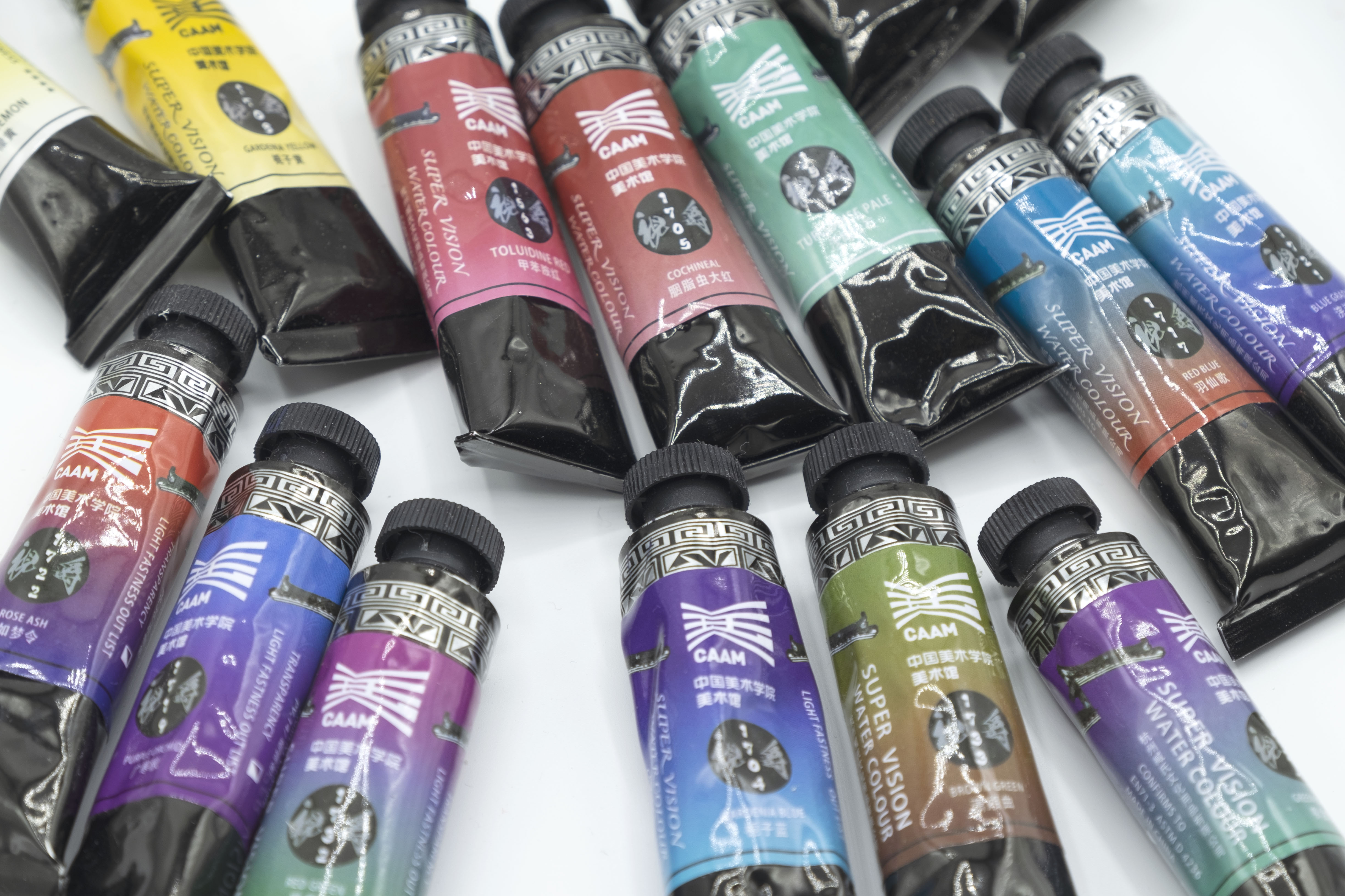
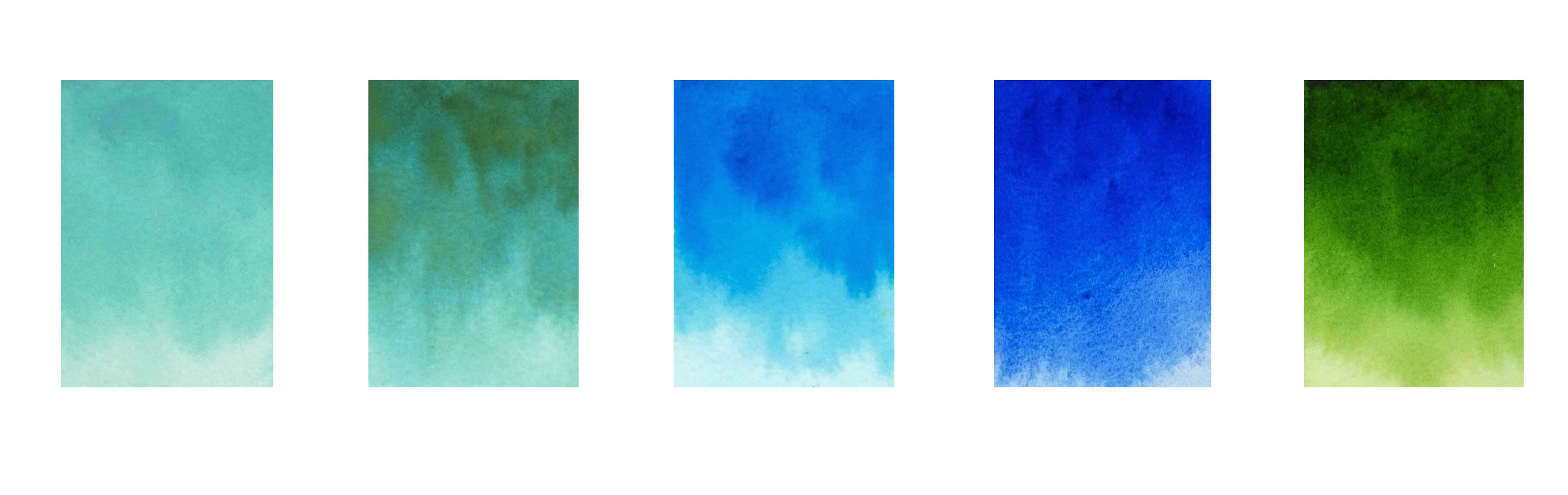
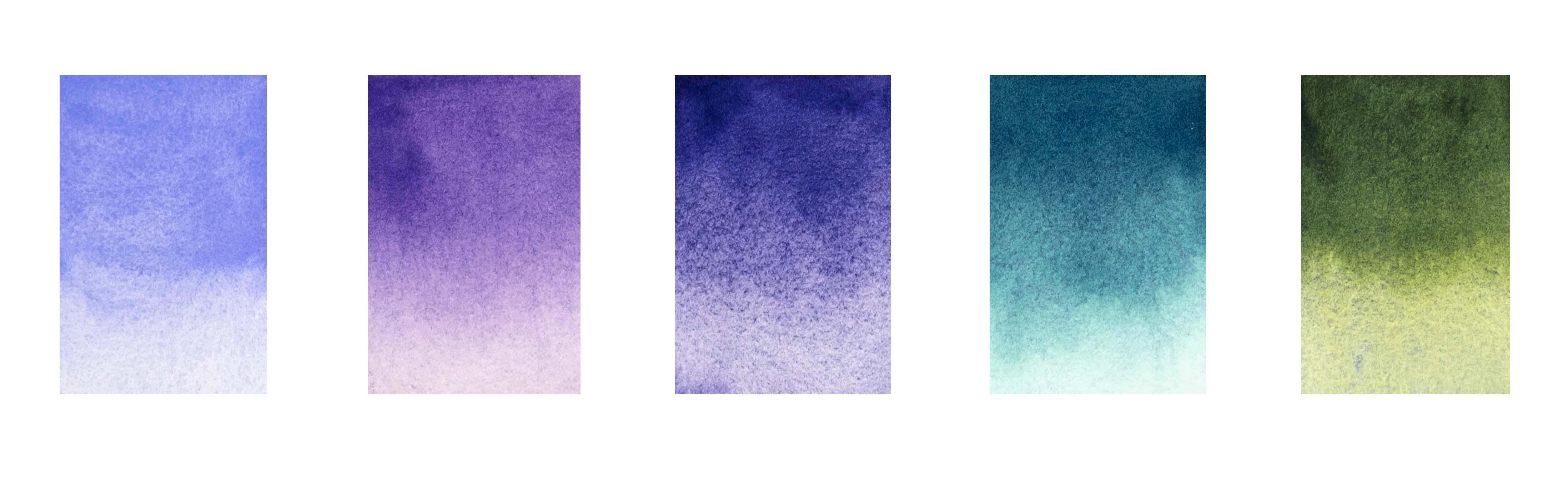
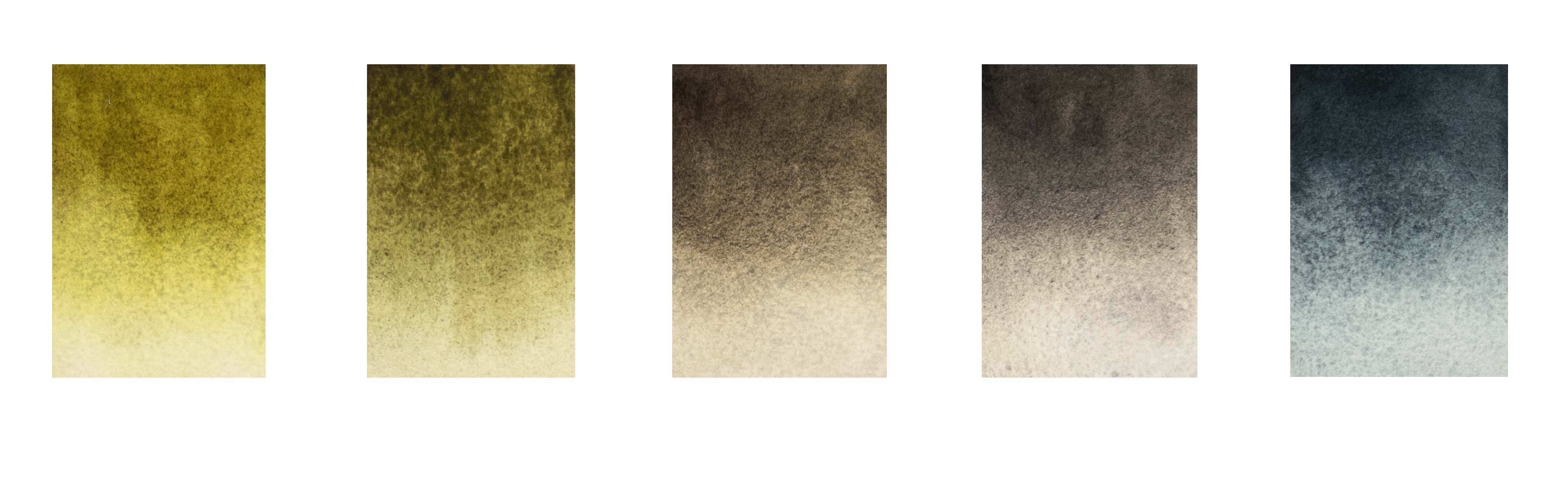
以下是一些礦物色/植物色的色票,大部分的顏色都十分鮮艷,我自己特別喜歡絳紫、黛青、空岐墨,另外梔子藍也是以往我不太會使用的顏色,非常鮮艷,染色極強,我的白色尼龍水彩筆毛都變成藍色,但運用在一些示範時又覺得效果很不錯
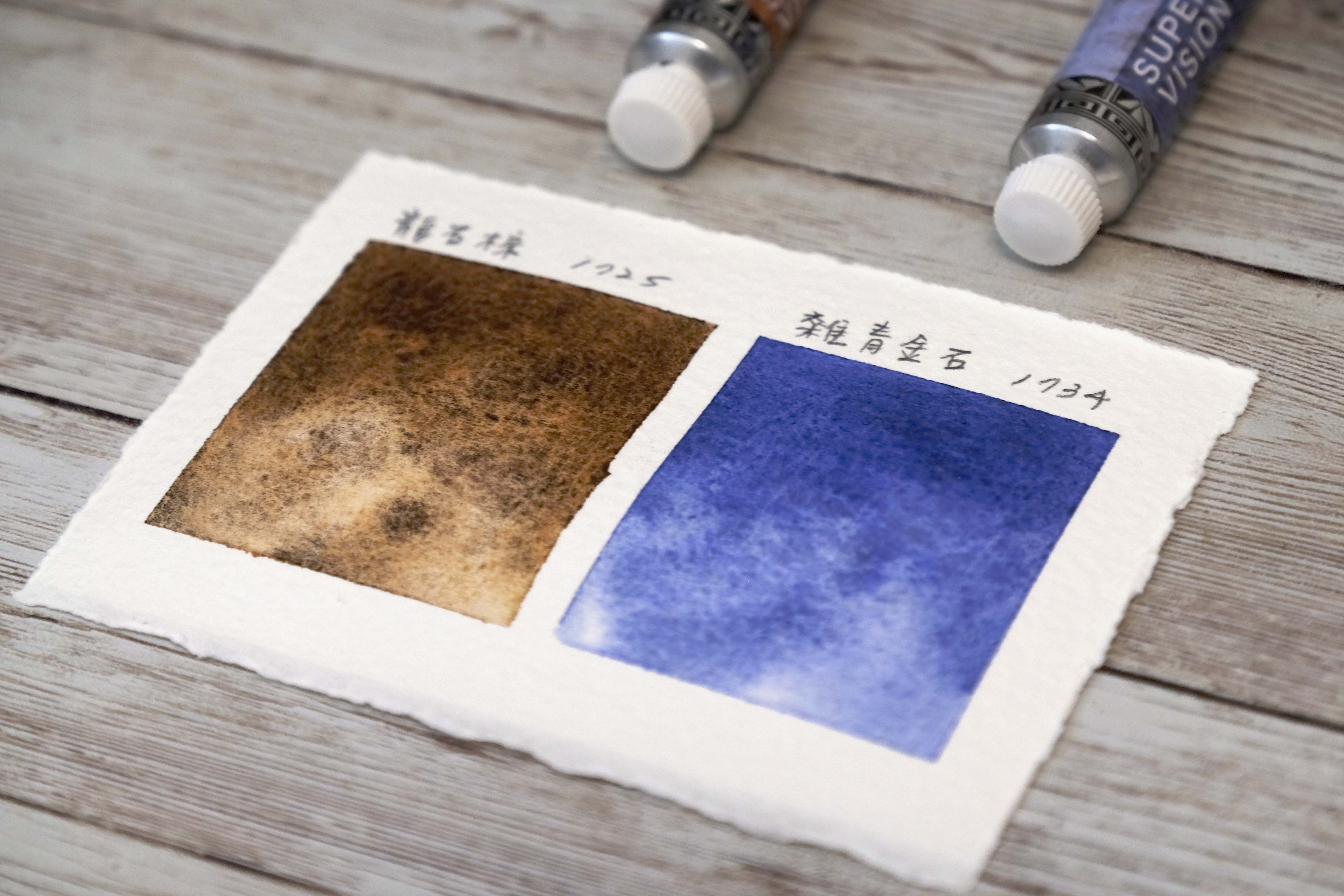
沉澱色
關於沉澱色的介紹可以參考→ 沉澱色水彩顏料 Granulating watercolor
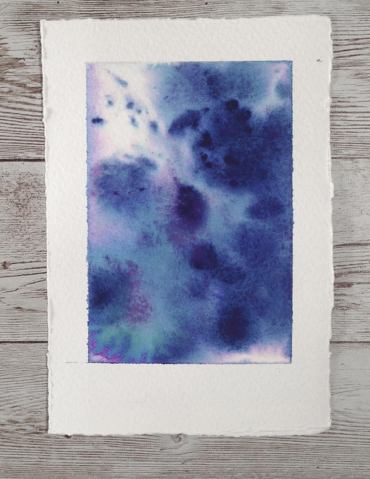
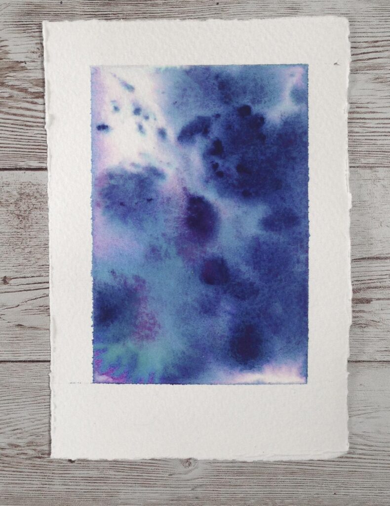
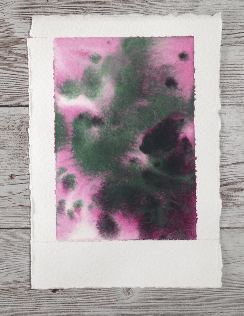
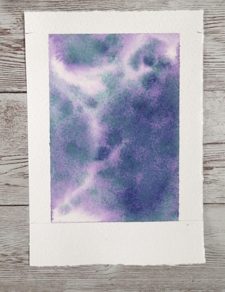
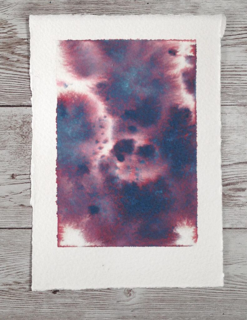
以濕中濕的方式表現,沉澱色的效果最為明顯,可以看到其中一個顏色擴散的幅度大於另一個主要顏色,以下共有六支特別的沉澱色:
如夢令 1722, 羽仙歌 1717, 采桑子 1732, 柳含煙 1724, 瀟湘曲 1733, 廣寒秋 1719
試色票時我覺得 柳含煙、羽仙歌 色調看起來特別優雅,如夢令的色彩也令人驚艷

運用練習
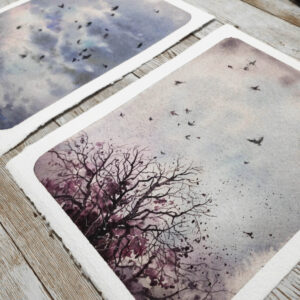
使用沉澱色來繪製一些作品吧!
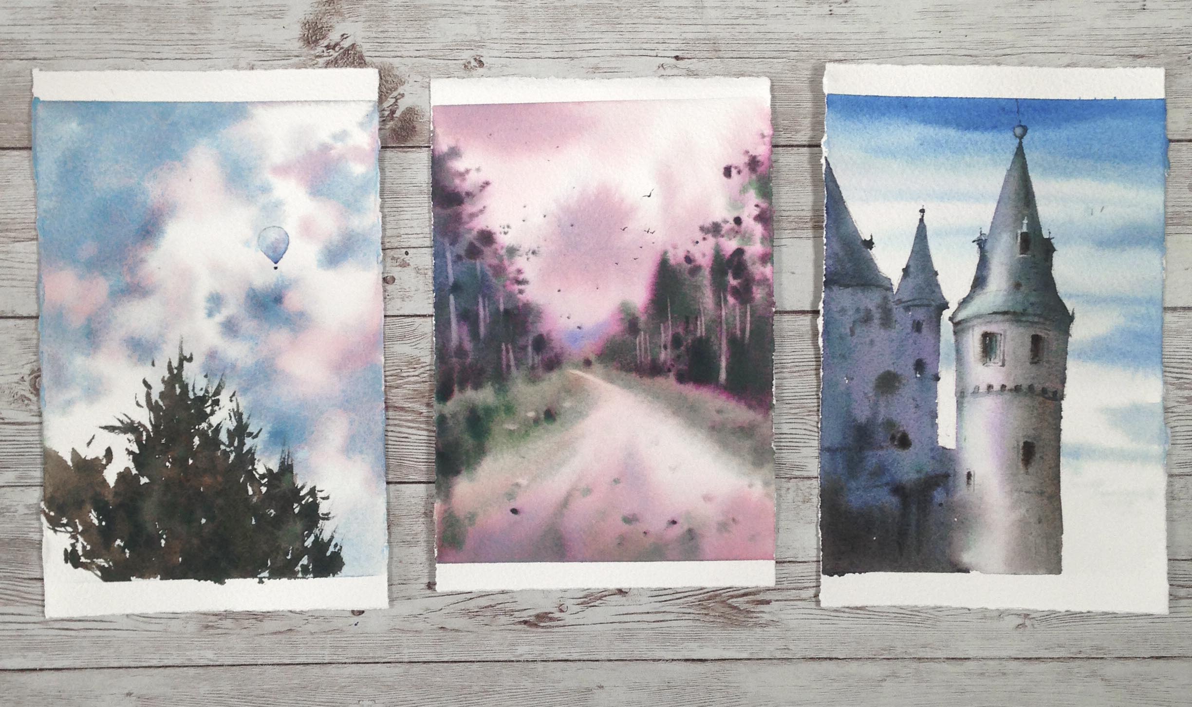
左
天空使用了羽仙歌和一點灰色調,很有趣的是當中的粉色是非常容易染色的顏色,不能完全從紙上擦洗起來,所以當我想在天空擦洗一點雲朵時,藍色能被洗起來一些,但留下粉紅的色塊
中
樹林是我最難想像如何使用的采桑子,由綠與粉結合,天空和地面則是淡淡的如夢令,畫面當然還配合一些其他顏色如深咖啡和綠,可以看到樹林的邊緣都有粉紅渲染,產生很奇特的效果,我自己還不曾這樣畫過呢,有點像幻境中的場景
右
城堡的主色使用柳含煙,在城堡圓柱的亮面位置可以明顯看到一些淡淡的紫與綠色調,左側的城堡暗面也有紫和綠的分層顏色,十分有趣

這麼多層次的顏色運用在一起不見得會有豐富的效果,可能還會讓畫面過於複雜及混濁,因此在使用分層色(沉澱色)時,可以選擇一到兩種為主色來表現,將特色呈現出來,也許會需要幾次嘗試,才能了解它適合在你的作品中的那些部分
希望你喜歡這篇顏料分享,歡迎追蹤這個部落格,更新文章時就會收到通知囉!